shieldcn Badges
Use shieldcn to add beautiful shadcn/ui-styled badges,
badge groups, charts, headers, sponsors grids, and contributor images to READMEs
and docs.
Base URL: https://shieldcn.dev
Install this skill
Install from the shieldcn repository with the Skills CLI:
npx skills add jal-co/shieldcn
Useful variants:
# Install globally instead of only the current project
npx skills add jal-co/shieldcn --global

# Install for a specific agent supported by the Skills CLI
npx skills add jal-co/shieldcn --agent AGENT_NAME

# Use once without installing
npx skills use jal-co/shieldcn@shieldcn-badges
Verify installation:
npx skills list
What to ask your agent
Copy one of these prompts after installing the skill. Replace bracketed values
with the real project details.
Great badge rows
Add a polished shieldcn badge row to my README for [owner/repo]. Include npm
version/downloads if this package is published as [package], GitHub stars,
license, CI status, and last commit. Center the row, make badges clickable, and
use a subtle shadcn style that works on GitHub light and dark themes.
Replace the existing Shields.io badges in this README with shieldcn equivalents.
Keep the same links where possible, remove stale or duplicate badges, and keep
the final row to 3-6 high-signal badges.
Migrate the existing Shields.io badges in this README to shieldcn, but undo any
split-style/two-tone badges. Use single-surface shieldcn badges instead: remove
split=true, labelColor, and other split-label styling unless a split badge is
explicitly needed for readability.
Create a compact shieldcn badge group for [owner/repo] with stars, license,
contributors, and last commit. Use one grouped image when that is cleaner than
separate badges.
Add release-quality README badges for a TypeScript library named [package]. I
want npm version, monthly downloads, license, types, GitHub stars, CI, and a
small branded static badge if it improves the visual hierarchy.
Headers and hero sections
Design the top of my README using shieldcn: add an adaptive header banner for
[project name], a one-sentence tagline, and a centered badge row. Use GitHub
<picture> markup so the header and badges adapt to light/dark mode.
Add a left-aligned shieldcn header to my README with title [title], subtitle
[subtitle], logo [simple-icons slug], and a graph/grid style that fits a
technical open-source project.
Charts and visual proof
Add a shieldcn npm download chart for [package] to the README. Use a concise
caption and choose chart dimensions that work well on GitHub mobile.
Add a shieldcn lifetime commit chart for [github username]. If multiple users
are listed, compare them in one chart and explain what the chart shows.
Bigger README work
Improve this README's above-the-fold impression with shieldcn. Keep the content
accurate, add a header, badges, and one chart only where they help, and avoid
visual clutter.
I want to generate a whole README visually. Point me to shieldcn README Studio
and explain which blocks I should use for this project.
Agent workflow
When this skill is loaded for a README/docs task:
- Inspect the existing README and package metadata before editing.
- Identify the project type: library, app, CLI, docs site, template, or skill.
- Choose only high-signal badges. Default to 3-6 badges above the fold.
- Use real values for
owner, repo, package names, workflow names, and links.
- Prefer SVG for Markdown images. Use PNG only when the target host blocks SVG.
- Make badges clickable with
<a> wrappers when they represent an external page.
- Use
<p align="center"> for centered rows in GitHub READMEs.
- Use GitHub
<picture> markup when a header/chart/badge needs explicit light
and dark URLs.
- Avoid leaving placeholders in the user's README. Placeholders are fine only in
examples or drafts.
- If the user wants a full README rather than a few assets, suggest README
Studio at
https://shieldcn.dev/studio.
URL basics
https://shieldcn.dev/{provider}/{...params}.svg          SVG badge/image
https://shieldcn.dev/{provider}/{...params}.png          PNG badge/image
https://shieldcn.dev/{provider}/{...params}.json         raw resolved data
https://shieldcn.dev/{provider}/{...params}/shields.json Shields.io-compatible JSON
Markdown patterns:
[](https://link)

Adaptive GitHub pattern:
<p align="center">
  <picture>
    <source media="(prefers-color-scheme: dark)" srcset="https://shieldcn.dev/header/graph.svg?title=Acme&subtitle=Build+faster&logo=react&mode=dark" />
    <img alt="Acme" src="https://shieldcn.dev/header/graph.svg?title=Acme&subtitle=Build+faster&logo=react&mode=light" />
  </picture>
</p>
Common badge endpoints
GitHub
Both route styles work: /github/{topic}/{owner}/{repo} and
/github/{owner}/{repo}/{topic}.
| Badge | Endpoint | Example |
|---|
| Stars | /github/stars/{owner}/{repo} | /github/stars/vercel/next.js |
| Forks | /github/forks/{owner}/{repo} | /github/forks/vercel/next.js |
| License | /github/license/{owner}/{repo} | /github/license/vercel/next.js |
| Release | /github/release/{owner}/{repo} | /github/release/vercel/next.js |
| CI status | /github/ci/{owner}/{repo} | /github/ci/vercel/next.js |
| Issues | /github/issues/{owner}/{repo} | /github/issues/vercel/next.js |
| Open PRs | /github/open-prs/{owner}/{repo} | /github/open-prs/vercel/next.js |
| Contributors | /github/contributors/{owner}/{repo} | /github/contributors/vercel/next.js |
| Last commit | /github/last-commit/{owner}/{repo} | /github/last-commit/vercel/next.js |
| Watchers | /github/watchers/{owner}/{repo} | /github/watchers/vercel/next.js |
| Downloads | /github/dt/{owner}/{repo} | /github/dt/vercel/next.js |
| Dependabot | /github/dependabot/{owner}/{repo} | /github/dependabot/vercel/next.js |
CI supports ?workflow=name&branch=main.
Package registries
| Badge | Endpoint | Example |
|---|
| npm version | /npm/{package} | /npm/react |
| npm version tag | /npm/v/{package}/{tag} | /npm/v/next/canary |
| npm weekly downloads | /npm/dw/{package} | /npm/dw/react |
| npm monthly downloads | /npm/dm/{package} | /npm/dm/react |
| npm yearly downloads | /npm/dy/{package} | /npm/dy/react |
| npm total downloads | /npm/dt/{package} | /npm/dt/react |
| npm license | /npm/license/{package} | /npm/license/react |
| npm types | /npm/types/{package} | /npm/types/react |
| npm dependents | /npm/dependents/{package} | /npm/dependents/react |
| PyPI version | /pypi/{package} | /pypi/flask |
| PyPI monthly downloads | /pypi/dm/{package} | /pypi/dm/flask |
| Crates.io version | /crates/{crate} | /crates/serde |
| Docker Hub pulls | /docker/pulls/{image} | /docker/pulls/library/nginx |
| JSR version | /jsr/{@scope}/{name} | /jsr/@std/path |
| Bundlephobia minzip | /bundlephobia/minzip/{package} | /bundlephobia/minzip/react |
| Homebrew version | /homebrew/{formula} | /homebrew/node |
| Maven version | /maven/{groupId}/{artifactId} | /maven/org.apache.maven/maven-core |
| Packagist version | /packagist/v/{vendor}/{package} | /packagist/v/laravel/framework |
| RubyGems version | /rubygems/{gem} | /rubygems/rails |
| NuGet version | /nuget/{package} | /nuget/Newtonsoft.Json |
| Pub.dev version | /pub/{package} | /pub/flutter |
| CocoaPods version | /cocoapods/{pod} | /cocoapods/Alamofire |
For npm scoped packages, keep the full scope: /npm/v/@scope/package.
Social, quality, and skills
| Badge | Endpoint | Example |
|---|
| Discord online | /discord/{serverId} | /discord/1316199667142496307 |
| Discord members by invite | /discord/members/{inviteCode} | /discord/members/nextjs |
| Reddit subscribers | /reddit/subscribers/r/{subreddit} | /reddit/subscribers/r/reactjs |
| Bluesky followers | /bluesky/followers/{handle} | /bluesky/followers/bsky.app |
| YouTube subscribers | /youtube/subscribers/{channelId} | /youtube/subscribers/UCxxxxxx |
| Mastodon followers | /mastodon/followers/{instance}/{acct} | /mastodon/followers/mastodon.social/Gargron |
| Hacker News karma | /hackernews/{userId} | /hackernews/pg |
| Codecov | /codecov/{service}/{owner}/{repo} | /codecov/gh/vercel/next.js |
| VS Code installs | /vscode/installs/{publisher}/{ext} | /vscode/installs/esbenp/prettier-vscode |
| WakaTime | /wakatime/{username} | /wakatime/@user |
| Skill installs | /skills/installs/{owner}/{repo}/{skill} | /skills/installs/vercel-labs/agent-skills/vercel-react-best-practices |
| Skill rank | /skills/rank/{owner}/{repo}/{skill} | /skills/rank/vercel-labs/agent-skills/vercel-react-best-practices |
| Trending skill rank | /skills/trending/{owner}/{repo}/{skill} | /skills/trending/vercel-labs/agent-skills/vercel-react-best-practices |
| Hot skill rank | /skills/hot/{owner}/{repo}/{skill} | /skills/hot/vercel-labs/agent-skills/vercel-react-best-practices |
Custom and grouped badges
| Type | Endpoint | Example |
|---|
| Static | /badge/{label}-{message}-{color} | /badge/build-passing-brightgreen |
| Dynamic JSON | /badge/dynamic/json?url=...&query=... | Fetch any JSON API |
| HTTPS endpoint | /https/{hostname}/{path} | Proxy a JSON endpoint |
| Badge group | /group/{badge1}+{badge2}.svg | /group/github/vercel/next.js/stars+github/vercel/next.js/license.svg |
Badge groups render several badges as one joined shadcn ButtonGroup-style image.
Use them when a README row is visually busy or when the badges share one link.
Badge styling options
Append query params as ?key=value&key2=value2.
| Param | Values | Default | Notes |
|---|
variant | default, secondary, outline, ghost, destructive, branded | default | shadcn Button variant |
size | xs, sm, default, lg | sm | Badge size |
mode | dark, light | dark | Explicit color mode |
theme | zinc, slate, blue, green, rose, orange, violet, purple, cyan, emerald | — | Theme accent |
font | inter, geist, geist-mono, jetbrains-mono, fira-code, roboto, space-grotesk | inter | Font family |
split | true, false | false | Two-tone label/value badge |
logo | SimpleIcons slug, ri:Name, data:image/svg+xml;base64,..., false | auto | Icon source |
logoColor | hex without # | auto | Icon color |
label | string | auto | Override label text |
color | hex without # | — | Main badge color |
labelColor | hex without # | — | Split label background |
valueColor | hex without # | — | Value text color |
labelTextColor | hex without # | — | Label text color |
labelOpacity | 0-1 | 0.7 | Label opacity in split badges |
gradient | comma-separated hex stops, optional angle | — | Example ff6b6b,4ecdc4,135 |
statusDot | true, false | auto for CI | Show a status dot |
animate | pulse, glow, shimmer, none | none | SVG-only animation |
height, fontSize, radius, padX, iconSize, gap, labelGap | number | per size | Fine tuning |
Style recommendations:
variant=secondary is the safest default for quiet, professional README rows.variant=branded is best for one or two brand badges, not every badge.split=true works well for status/data pairs where label and value should be
distinct.mode=light/mode=dark is useful inside <picture> for adaptive GitHub
READMEs.gradient= and animate= should be used sparingly; they are accents, not the
default look.
Charts
Charts render as portable SVG/PNG images styled like shadcn cards.
Star history charts are retired — GitHub restricted the stargazers API to repo
admins/collaborators (June 2026). /chart/github/stars/... URLs render a
100×1 transparent image; use an issues, commits, or npm downloads chart
instead. Plain stars count badges still work.
/chart/github/issues/{owner}/{repo}.svg      issues over time
/chart/github/commits/{user}.svg             lifetime contribution commits
/chart/npm/{package}.svg                     npm download history
/chart/json.svg?values=10,25,40,30,60        inline values
/chart/json.svg?url=...&query=...            remote JSON values
Markdown example:
[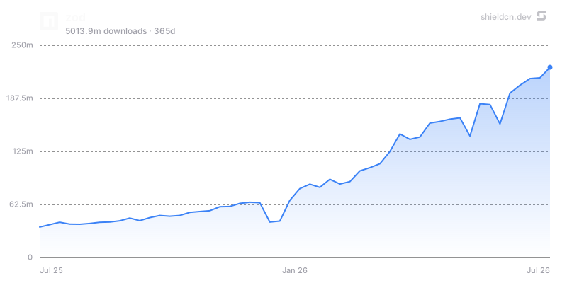](https://www.npmjs.com/package/zod)
Chart params: theme, font, color, fill, area, width, height,
title, icon, iconColor, mode, bg/background, border, yScale,
yMin, yMax, yTicks, xTicks, and for npm charts days.
Use charts when they tell a story: adoption over time, download trend, issue
load, or contribution history. Avoid adding charts purely as decoration.
Headers render repository banners from one URL.
/header/{preset}.svg?title=Acme&subtitle=A+delightful+toolkit
/header/{preset}.png?title=Acme&subtitle=A+delightful+toolkit
/header/{preset}.json?title=Acme&subtitle=A+delightful+toolkit
Presets: surface, gradient, dots, grid, graph, glow, transparent.
Common params: title, subtitle, logo, logoColor, theme, size,
width, height, align, font, border, radius, bg, gradient,
pattern, glow, accent, titleColor, subtitleColor, image, overlay,
tint, and watermark.
Centered header example:
<p align="center">
  <img src="https://shieldcn.dev/header/gradient.svg?title=Acme&subtitle=A+delightful+toolkit&logo=react" alt="Acme" />
</p>
Use align=left for technical/product README hero banners and align=center
for logos, frameworks, or portfolio-style projects. Use bg=transparent when
embedding into an already styled page.
/sponsors/{login}.svg
/contributors/{owner}/{repo}.svg
Both support SVG/PNG plus the same card background system used by headers:
preset, theme, bg, gradient, pattern, glow, image, overlay,
tint, accent, radius, border, and watermark. Contributors also support
controls like limit, min, and names.
Use these below the main intro or near community sections, not in the top badge
row.
README Studio
For building or redesigning an entire README visually, point the user to
README Studio: https://shieldcn.dev/studio.
README Studio is a Figma-style editor with reorderable blocks: Text/Markdown,
Header, Badges, Chart, Table, and Image. It exports clean GitHub-flavored
Markdown and has an Adaptive toggle that exports badges, headers, and charts as
GitHub <picture> elements that follow the reader's light/dark theme.
Suggest Studio when the user asks for a full README, a visual editor, a README
generator, or broad redesign rather than a few specific badge/image edits.
Quality rules
- Use
.svg for Markdown images unless the target host requires PNG.
- Keep top badge rows to 3-6 high-signal badges.
- Link badges to their relevant destinations.
- Prefer
variant=secondary for calm rows; use branded selectively.
- Use
mode=light/mode=dark with <picture> when visual parity matters.
- Use provider auto-icons unless a custom logo materially improves clarity.
- Keep alt text human-readable:
npm version, GitHub stars, CI status.
- Test generated URLs in a browser or with
curl -I when editing real docs.
- Do not hardcode private tokens or secrets in badge URLs.
- Do not leave example placeholders in final README output.
Docs
 anthropics/skills180k
